Cottage Springs
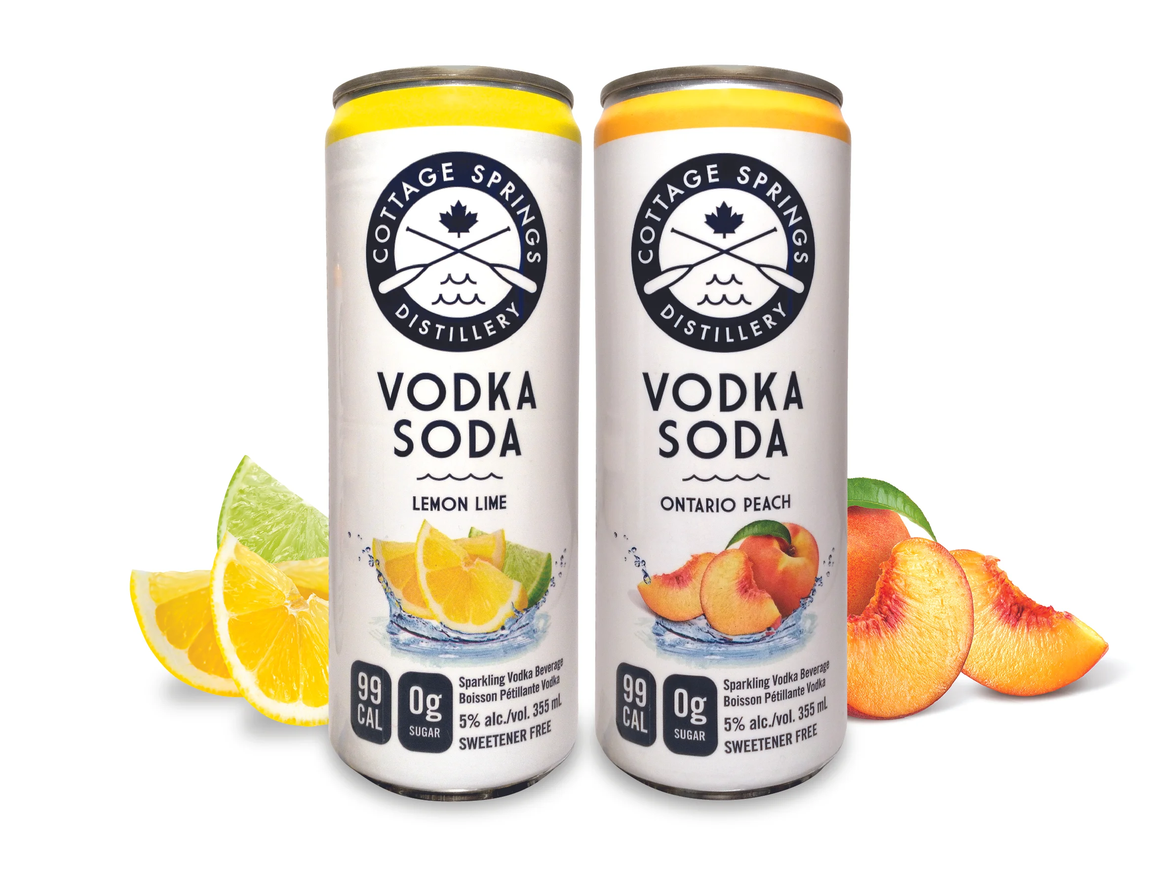
Branding and packaging design for Cottage Springs Distillery’s new line of Vodka Sodas.
Cottage Springs Distillery
It's Cottage Season
Inspired by the Canadian love of cottaging, Cottage Springs Distillery set out to create a brand that would feel as comfortable in a downtown condo as it would at the cottage. Understanding that “cottage” means different things to different people, we focussed on the Canadian experience - our lakes and waters. The logo brings together this core cottaging element and our proud maple leaf to create a modern brand with an underlay of nostalgia. The packaging uses high contrast navy on clean white with strong flavour cues. The splash of water supports a “refreshing” message while reinforcing the role Canada’s lakes, rivers and streams have played in our foundation. A perfect drink for a perfect country – besides who doesn’t love the cottage?
CLIENT
Cottage Springs Distillery
ROLE
Branding, Packaging