VIA RAIL
FEAST FROM
Nothing quite conjures the imagination of what it means to be Canadian than the mighty train. The quintessential geography of our great land is etched in the minds of all Canadians as well as global audiences who aim to witness in real time our Rockies, our Prairies, our Lakes and our Oceans. A country built by rail, the history is vast and magnificent. Today’s travelers – both domestic and international – yearn for romantic travel while expecting elevated dining experiences. Working with a collaborative team we crafted enroute menu and packaging structures that offer both versatility as well as clarity of messaging. Flexibility, clarity and a celebration of our regional differences guided the entire process.

Being Canadian means a celebration of our two official languages. Wonderfully challenging, designing type to fit a given space often calls for detailed typesetting “tricks” to make it all come together in a cohesive, legible manner. Close cropped photography allows for product interchangeability as routes, distribution and other customizations are called for.

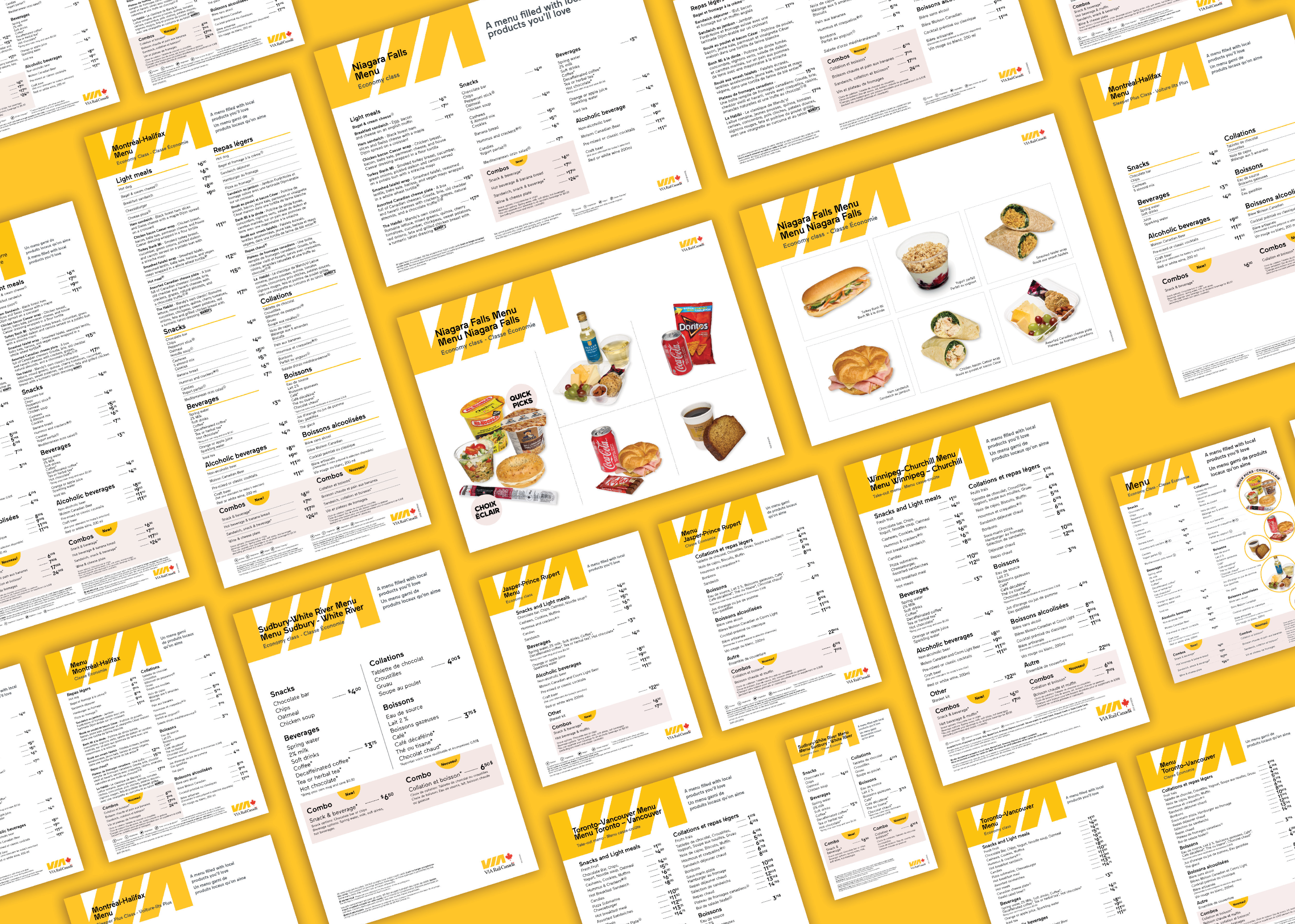
We enjoyed our virtual travel across Canada as we dove into the individual routes and the specific menu offerings that were based on regional product access. What looked simple became an organizational feat with many Excel files to guide our way.


As expected, VIA Rail holds tight adherence to established brand structures. These involve both tangible and intangible assets from logo, colours, fonts, image clarity and backdrops – every element must work across multi-platform and agency networks. We were ever proud to become a partner agency working with this iconic brand. 8 routes, 26 menus, 2 languages, 100’s of products required close teamwork, lots of proofing and cross-functional collaboration.
Following the menus our attention shifted to developing a flexible packaging and labelling system. This system had a variety of challenges: reduce to the lowest amount of common sizing, provide clear areas for product specific over print, provide appropriate space for all mandatory decks (bilingual + long and short in length), allow for integration of the Canadian Food Inspection Agency’s new FOP (Front of Pack) symbolling system.


The end project result is a testament to how groups working together, each focussed on their core parts, makes the dream work. Trust that all involved know their craft and are doing their best for the collective whole is the only way to work. Our studio was challenged but happy.


PROJECT
Project support and management surrounding the development of menu and packaging labelling systems
CLIENT
VIA Rail
WHAT WE DID
Brand adherence, Print design and typesetting, Packaging planning and activations